Click here to see my first post about this project. I'll post new photos when I actually do something to the cupboard house. Because I have a deadline and limited materials, I'm being a designer about it and sketching things out first. Here's how that's going;
The cupboard's setup is a little odd. The front is basically a silhouette of a house and the inside is a shelving unit that really doesn't match. All white, it isn't a distraction, so hopefully my siding decisions won't mess that up. I had already decided to do stone(egg carton) siding. The Van Buren's going to be an old cobblestone, so it's clean cut stone for this house.

(Just took a photo and painted over it in Photoshop)
I don't remember which architect it was (I know it was around Frank Lloyd Wright's time, pretty sure it wasn't him though. Oh, this is going to bug me...), but they thought that tall buildings should be designed to actually look tall. I kind of agree, and this house has four floors (that's tall), so I'm (hopefully) adding some vertical wood paneling along the windows to make it feel more like you're looking at a tall little house. Although, next to those small stone bricks it is looking a tad busy, so bigger stone pieces,...maybe.
I also decided to add in a small sculptural element in-between the two upper windows as an interesting detail (sculpted out of paperclay). I marked it's place in the above sketch idea, but didn't really have any inspiration for the design.
In my parents' kitchen, there's a very busy, entertaining old 70's wallpaper (some hate it, I love it). I kind of liked these two characters;


I don't hate it, but I did not really want to use red for the exterior. So I saved it in gray-scale, printed it out, and used colored pencils to sketch in some details.

I think I'm almost ready to actually begin work on the exterior. ^_^
So how are the inside sketches going?
Well I decided that the, "Crawl Space", will be a basement. And I started mapping out the 1st floor above that;
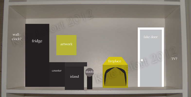
(It's like a pile of blocks-I did this one in Illustrator, btw)
I labeled it for you, so I don't have to explain much. It's a kitchen/living room. Left is the kitchen. Right is the living room. There will be cushions or chairs once I figure out how much will fit in this space(haven't measured anything yet). The fireplace is something I've been wanting to try since last summer. This house has two implied chimneys and no giant windows to stop me. No nautical stuff though. I haven't settled a theme yet, but I know brass seashells would be a bit much(sorry houseboat fireplace).
Colors for this room,...For some reason I want to use black and yellow. That's a potentially ugly combination, (And I thought it up before I remembered the brass fireplace-which would match...) but it is different from anything I've done before. That's one of my goals with this project, so I'll go with it (at least in the sketches).
The door on the right would just be for show. The house seems a bit narrow, and I don't have room for stairs, so I'm thinking that adding in some fake doors will make it look a little more believable as a house.
I'm still a little torn on what artwork will be on the back wall. I've used business cards and print-outs before, but that was stuff I've had sitting around since I was a kid. Now I'm an adult, and an illustrator. I kind of think I should be using more of my own work. The only piece that I have that works with my current concept is, "Dancing";

It's not quite right though. There's a ton of red, And who wants a foot in their kitchen? Maybe I'll draw something new, or recolor something else...I'll figure that out once I actually have a room in progress.
Well, that's my plan so far. I like that it's only December and I already have an almost-solid idea for the exterior(I don't even know if that was supposed to be sarcastic or not). Seriously though, if you're participating in this contest, and you haven't worked much under deadlines-Get started ASAP. May will be here before you know it and minis can take forever to finish. :)
Yes, I learned the hard way that it's so much better to plan it before you start it. Love your plans for the exterior. I was hoping to do something similar, but I don't know if I'll have time.
ReplyDeleteEven with my plan I'm running into problems, so I'm glad that I decided to sketch it all out first, this time.
Delete